This blog post will provide the CSS code you need to make all your modals bigger in Power Pages (previously known as Power Apps Portals). I will also explain why you should not use my code – and you guessed right – it has to do with usability and accessibility. That being said; this code comes from a portal in production that I created, so I know there are some cases when this is useful. So, please, use with caution.
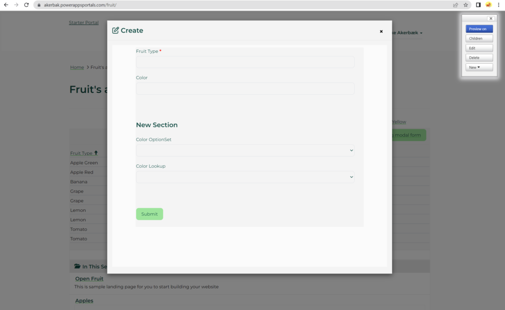
Normally the “big” modal you get out of the box look like this:
In some use cases, it’s needed to have bigger modals. Let’s look at how we can do this just by adding some CSS styling.
The Code
Let’s get right to it. There are two ways of doing this. If you are using flexbox with CSS on your portal then this first option is the best way to go. If you don’t, then the old-school option is the way to go.
Using flex
Add this styling to your CSS file if you are already using flexbox on your portal.
@media (min-width: 1024px){
.modal-lg {width: 80%}
}
.modal-dialog.modal-lg .modal-content {
display: flex;
flex-direction: column;
flex-wrap: nowrap;
align-content: stretch;
height: auto;
}
.modal-form .modal-body {
flex-grow: 1;
height: 90%;
}
.modal-form .modal-body iframe {
height: 90vh;
display: flex;
position: relative;
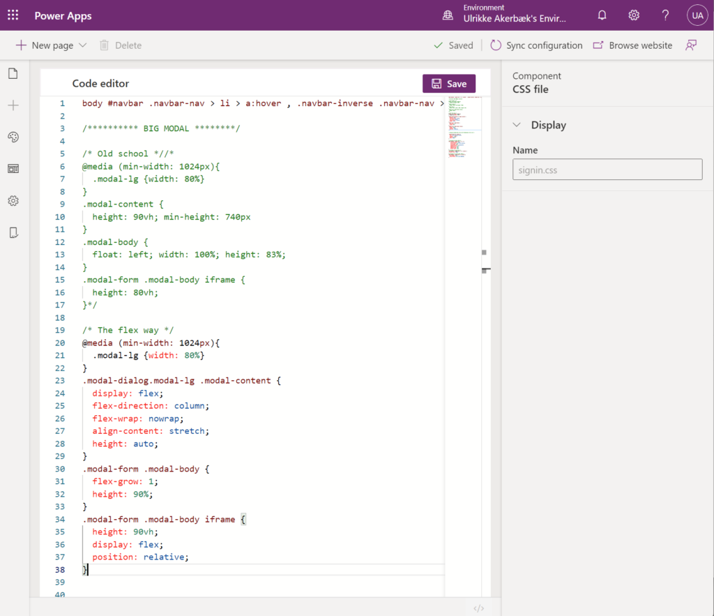
}Code language: CSS (css)This is what the styling looks like in the CSS file open in Power Apps Portals Design Studio:
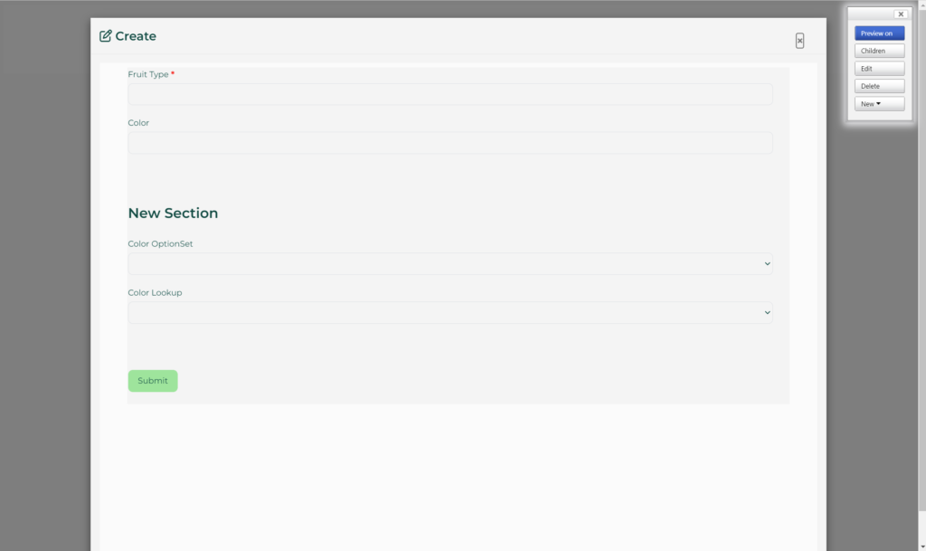
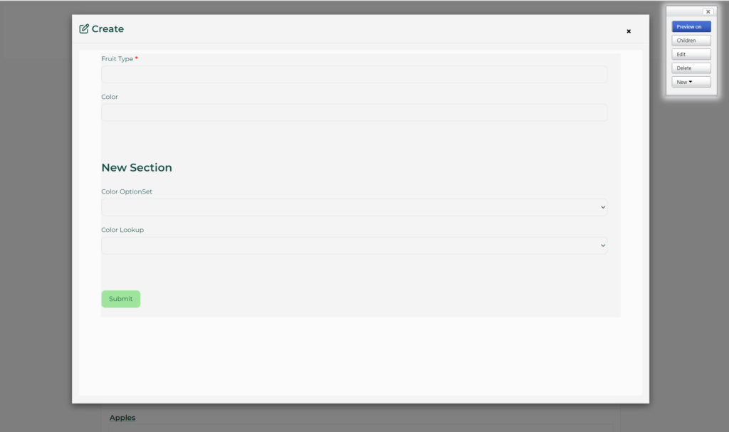
When this code is implemented the modal look this big:
Old School
If you are not using flexbox already, then paste this styling into your CSS file on your portal.
@media (min-width: 1024px){
.modal-lg {width: 80%}
}
.modal-content {
height: 90vh; min-height: 740px
}
.modal-body {
float: left; width: 100%; height: 83%;
}
.modal-form .modal-body iframe {
height: 80vh;
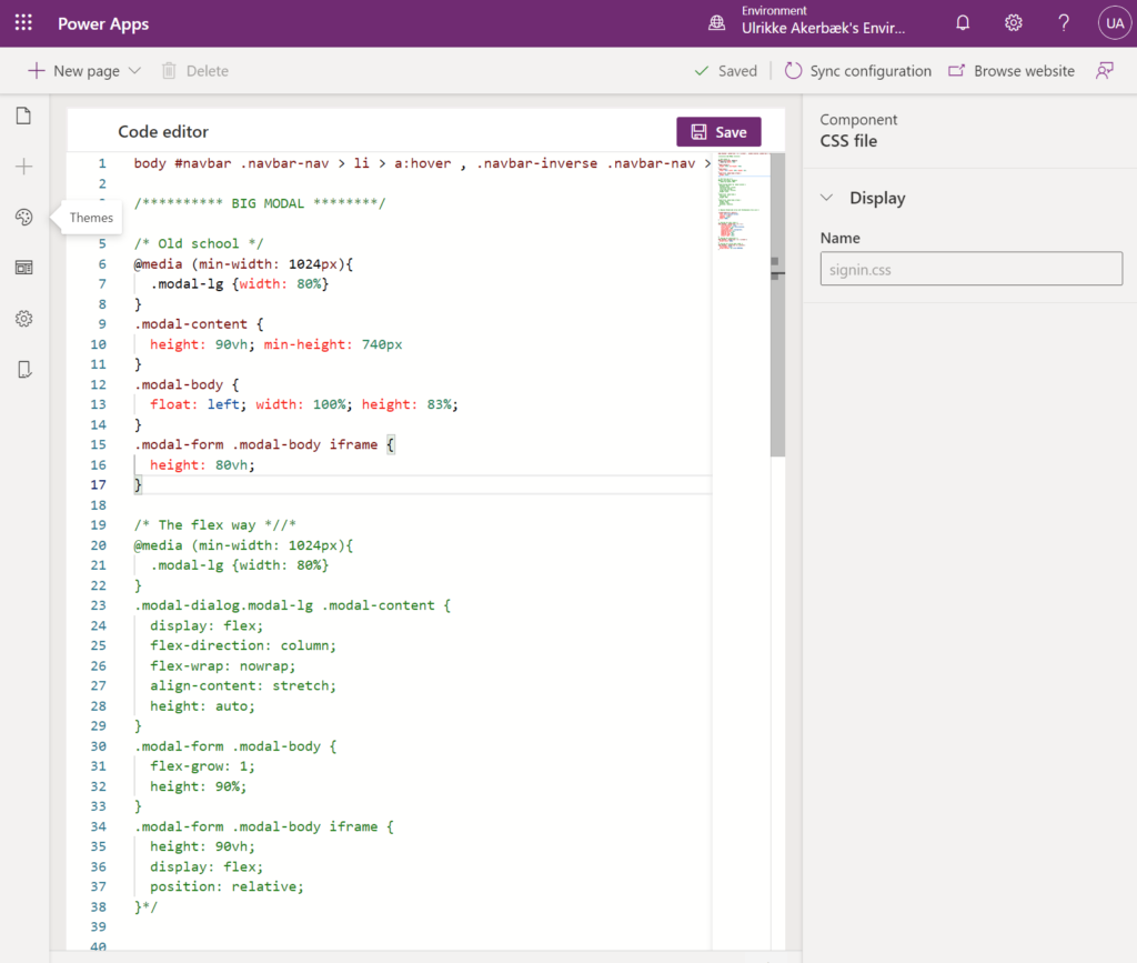
}Code language: CSS (css)What this looks like in the CSS file in my Power Apps Portals Designer:
This code creates the same big modal as the flex styling:
If you are not quite sure how to add styling to CSS files in your portal, then this blog post will help you learn how to work with branding and styling in a modern way with Power Pages and Power Apps Portals:
Your result is a modal window that stretches almost the edges of the screen and fills in almost completely. You will be able to fit any content you like in there – and the user will still see a hint of the original page in the background.
All well, right?
Not quite.
Accessibility and usability
There are concerns with modals when it comes to accessibility and usability. Modals can work well when you need to capture small pieces of information in the context of other information. Login is a good example, or when your user needs to create related content to a list that has few input fields the modal can be a good experience.
You should, however, not create big forms or complex interfaces inside modals. In those cases it’s better to send the user to a new page, capture the information and send the user back to the original page when the job is done.
Here are some useful links to articles you should read before implementing modals in your solution:
https://www.w3.org/TR/wai-aria-practices-1.1/examples/dialog-modal/dialog.html
https://accessibility.huit.harvard.edu/technique-accessible-modal-dialogs
https://uxmovement.com/forms/best-practices-for-modal-windows/
Hope this was useful! Good luck!
Feature Photo by Andrew Jenkins on Unsplash
Be First to Comment