In Portals Design Studio there is an option to “Enable Basic Theme”. But, what is Basic Theme in Power Apps Portals? And what does it do?
Learn what Basic Theme is in Power Apps Portals and how to enable it in the Portals Studio
Enable Basic Theme
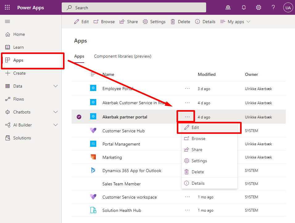
First – open make.powerapps.com and navigate to “Apps” in the left navigation. Identify your Portal App, open the item menu and choose “Edit” to open Portals Design Studio.
Need a map to all the different administration and configuration interfaces for Power Apps Portals? Look at this blog post for help: https://ulrikke.akerbak.com/2019/11/28/map-to-configuring-power-app-portals/
If you cannot find your Portal - make sure you are in the correct Environment
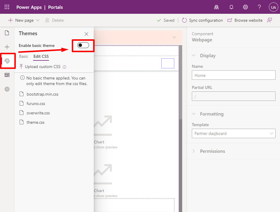
Open the “Themes” meny in the left navigation inside Portals Design Studio. At the top you find the option to “Enable Basic Theme” toggle. Enable it by clicking the toggle.
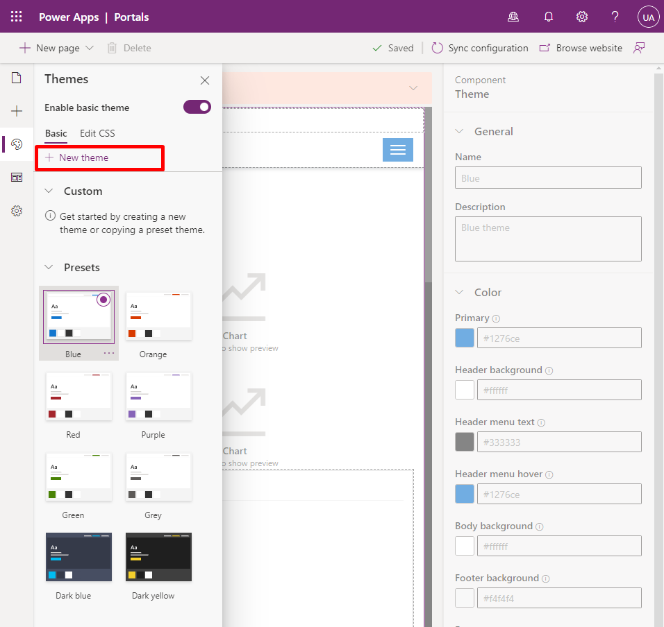
There are a number of Themes to choose from OOTB (out-of-the-box) that you can use as a starting point. We will create a new theme by clicking the “+ New theme” button at the top:
A new theme is created and the right hand panel show the details of our new theme. Clicking the “Name” input field will allow us to edit the theme.
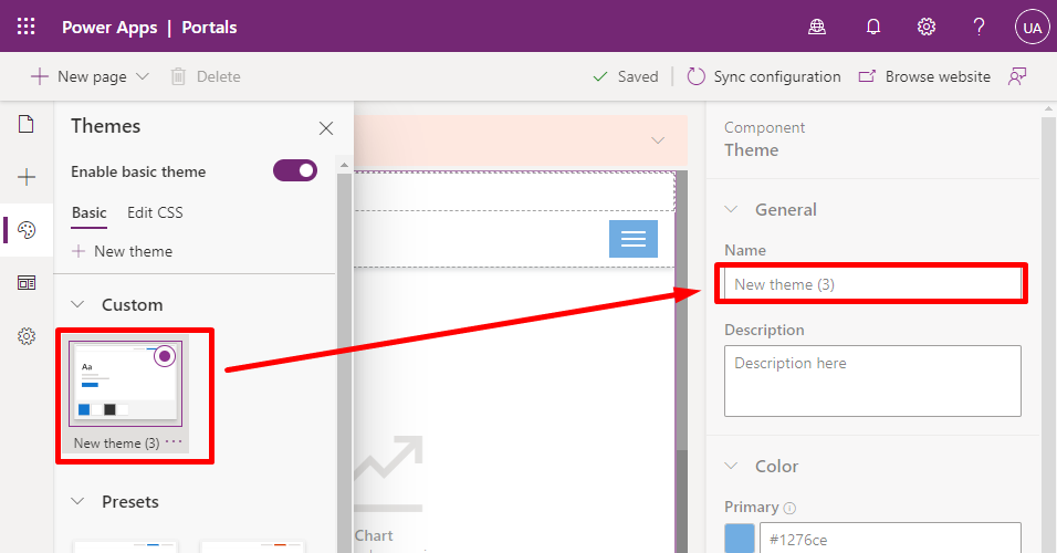
Give your theme a name and description.
Then add the primary colors that make up your basic theme. These are all the colors we can set:
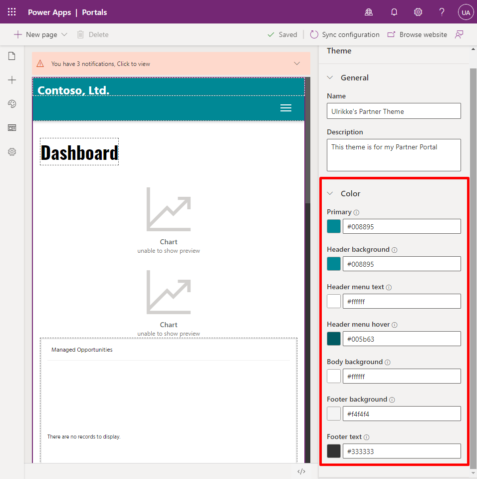
You can use HEX values like #ffffff (white) or RGB like rgb(255, 255, 255) to enter the colors you want. OR – you can simply click the color-sqare to open up the color picker to choose your color:
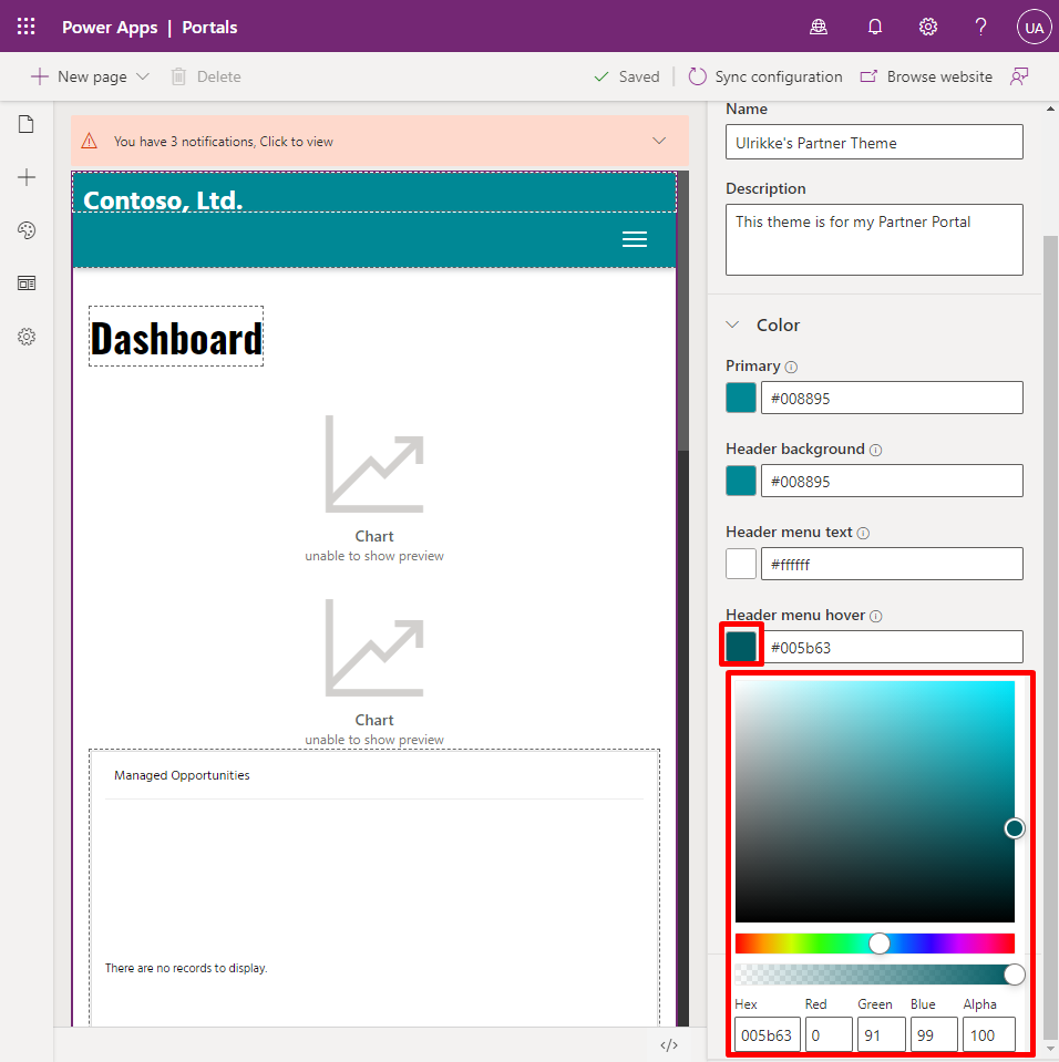
In this color picker you can also set opacity to create tranparent colors.
When you are finished selecting all your colors simply click “Browse” at the top right corner to see what the portal looks like with the new colors.
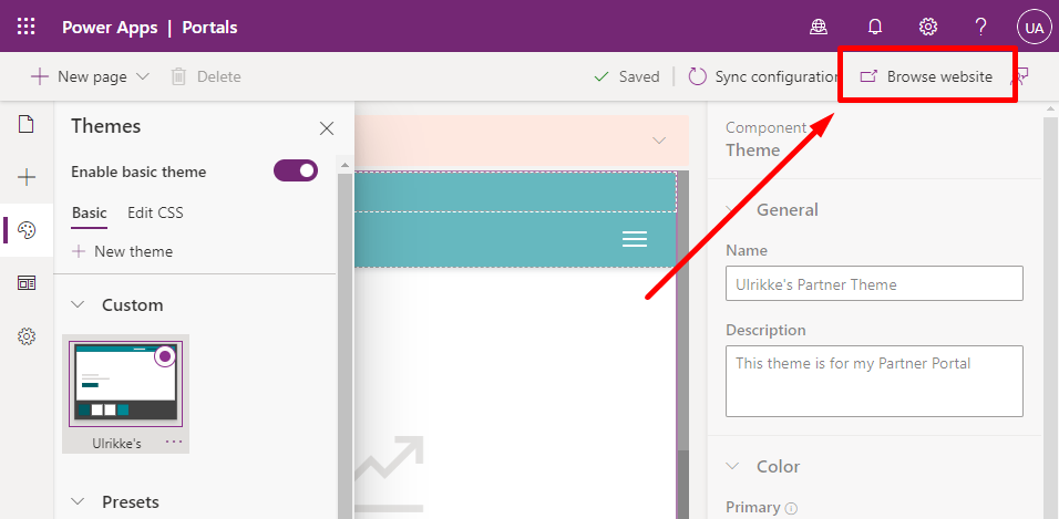
The portal will open up in a new tab and you’ll see the results.
Behind the scenes of Basic Theme
But – what is really happening?
The theme creator is creating a new CSS-file and adding it to your Portal header – just like if you were to upload a CSS-file yourself.
We can have a look at it by using the Developer Tool in the browser.
Hit F12 on the keyboard when you look at the portal in the browser. Your browser will open up it’s “Developer Tool”. Open “Elements” tab and you will see the HTML that make your portal.
At the very top you find the “<head>” tag. Open it by clicking the little arrow next to it.
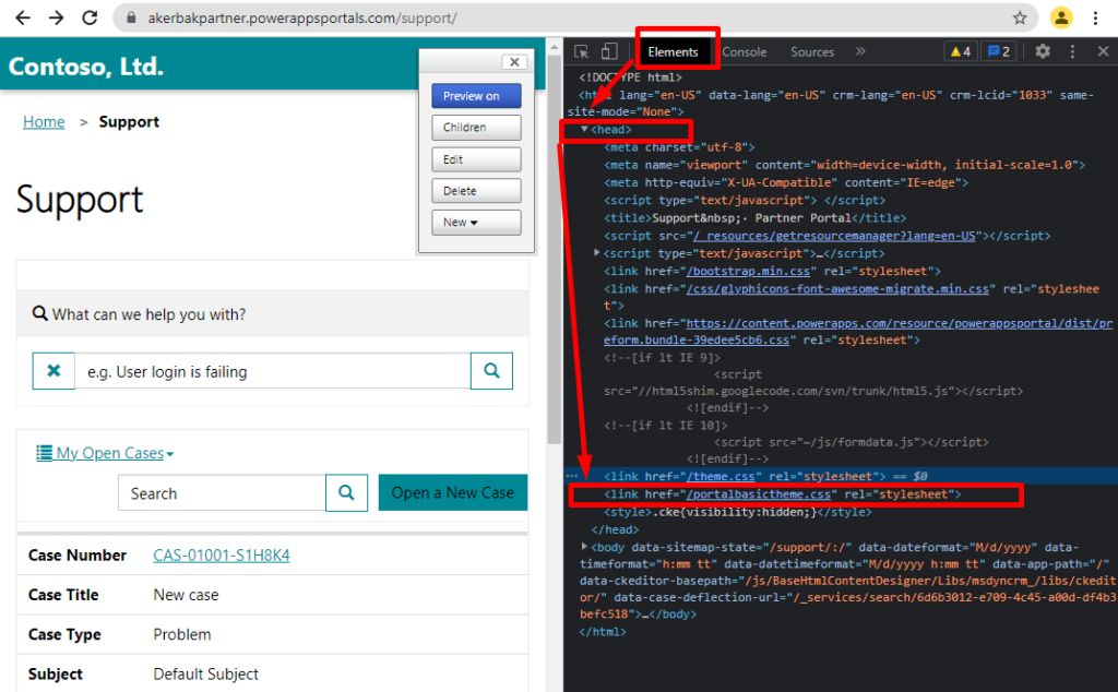
If you look closely at the content in the <head> tag you will find at leas these two lines:
<link href="/theme.css" rel="stylesheet">
<link href="/portalbasictheme.css" rel="stylesheet">Code language: HTML, XML (xml)
The first one is the theme that comes with the portal – and the second line is the theme you created. The last line will overwrite the first one – so your theme will win whenever there is any conflicting styles.
But – what styles are these? We only added some colors.. Let’s have a look!
Hold your mouse over the link “/portalbasictheme.css” and right click. A menu opens and you can choose “Open in new tab”. This will open the CSS file in a new tab and you can see the content!
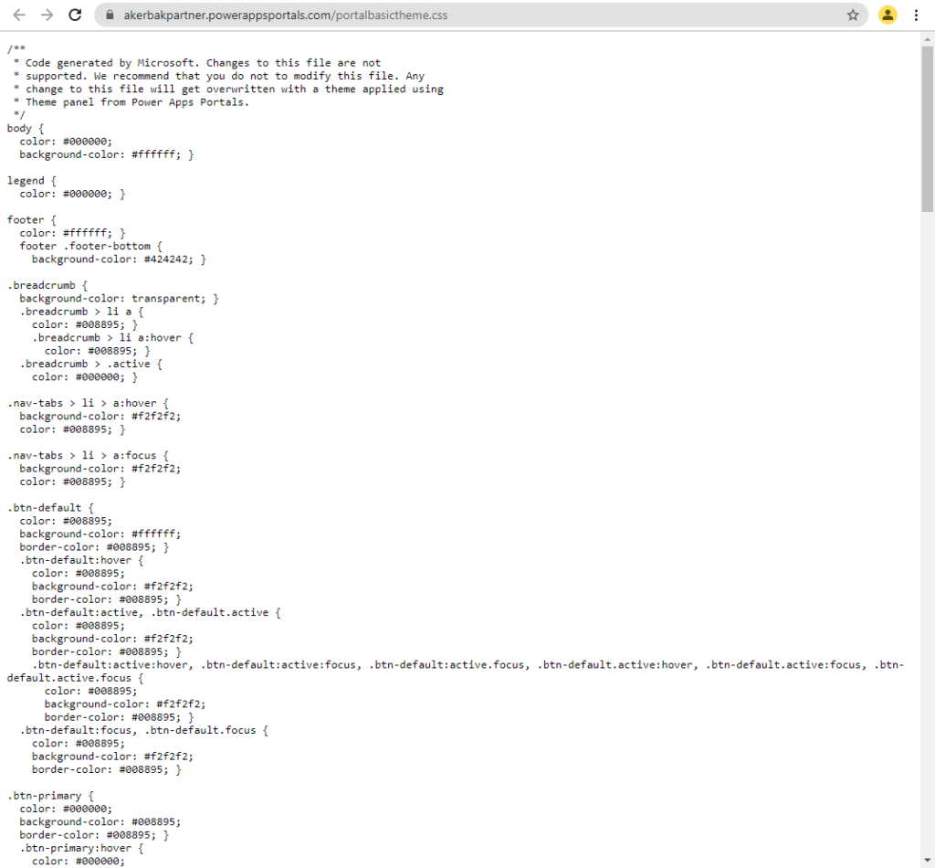
If you want to see the intire content of my basictheme.css go to the bottom of this blog post.
If we look closer at this CSS you will see that there are different colors then the once you set. These are darker and lighter shades of the colors you chose that the theming engine created for you to provide more depth of colur to your portal design – and to provide visual feedback like darker hover-color on buttons and meny items ect.
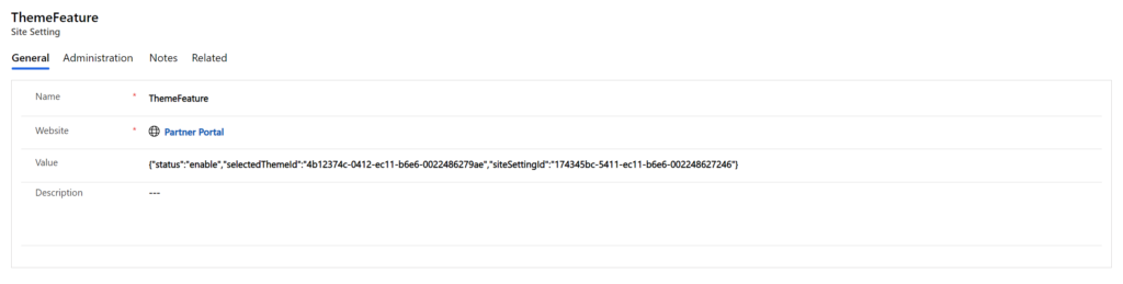
Site Setting for ThemeFeature
There is a Site Setting that updates and keeps track of which Theme is applied at all times and whether Basic Theme is enabled or not. You find it under “ThemeFeature” site settings.
Hope this was helpful to you and that you learned something new.
Have fun with it and please provide feedback and comments if you have any. Let’s get smarter together! 🙂
This is my Basic Theme in all it’s glory:
/**
 * Code generated by Microsoft. Changes to this file are not
 * supported. We recommend that you do not to modify this file. Any
 * change to this file will get overwritten with a theme applied using
 * Theme panel from Power Apps Portals.
 */
body {
  color: #000000;
  background-color: #ffffff; }

legend {
  color: #000000; }

footer {
  color: #ffffff; }
  footer .footer-bottom {
    background-color: #424242; }

.breadcrumb {
  background-color: transparent; }
  .breadcrumb > li a {
    color: #008895; }
    .breadcrumb > li a:hover {
      color: #008895; }
  .breadcrumb > .active {
    color: #000000; }

.nav-tabs > li > a:hover {
  background-color: #f2f2f2;
  color: #008895; }

.nav-tabs > li > a:focus {
  background-color: #f2f2f2;
  color: #008895; }

.btn-default {
  color: #008895;
  background-color: #ffffff;
  border-color: #008895; }
  .btn-default:hover {
    color: #008895;
    background-color: #f2f2f2;
    border-color: #008895; }
  .btn-default:active, .btn-default.active {
    color: #008895;
    background-color: #f2f2f2;
    border-color: #008895; }
    .btn-default:active:hover, .btn-default:active:focus, .btn-default:active.focus, .btn-default.active:hover, .btn-default.active:focus, .btn-default.active.focus {
      color: #008895;
      background-color: #f2f2f2;
      border-color: #008895; }
  .btn-default:focus, .btn-default.focus {
    color: #008895;
    background-color: #f2f2f2;
    border-color: #008895; }

.btn-primary {
  color: #000000;
  background-color: #008895;
  border-color: #008895; }
  .btn-primary:hover {
    color: #000000;
    background-color: #005962;
    border-color: #005962; }
  .btn-primary:active, .btn-primary.active {
    color: #000000;
    background-color: #005962;
    border-color: #005962; }
    .btn-primary:active:hover, .btn-primary:active:focus, .btn-primary:active.focus, .btn-primary.active:hover, .btn-primary.active:focus, .btn-primary.active.focus {
      color: #000000;
      background-color: #005962;
      border-color: #005962; }
  .btn-primary:focus, .btn-primary.focus {
    color: #000000;
    background-color: #005962;
    border-color: #005962; }

.navbar-static-top.navbar-inverse {
  background-color: #008895; }

.navbar-toggle {
  background-color: #008895; }

.navbar-inverse .navbar-toggle {
  border: 1px solid #008895; }
  .navbar-inverse .navbar-toggle:hover {
    background-color: #00717c; }
  .navbar-inverse .navbar-toggle:focus {
    border: 1px solid #000000;
    background-color: #00717c; }

.navbar-inverse .navbar-nav > li > a {
  color: #ffffff; }
  .navbar-inverse .navbar-nav > li > a:hover {
    background-color: #005b63;
    color: #ffffff; }
  .navbar-inverse .navbar-nav > li > a:focus {
    background-color: #005b63;
    color: #ffffff; }

.navbar-inverse .navbar-nav > .open > a {
  color: #ffffff;
  background-color: #005b63; }
  .navbar-inverse .navbar-nav > .open > a:hover {
    color: #ffffff;
    background-color: #005b63; }
  .navbar-inverse .navbar-nav > .open > a:focus {
    color: #ffffff;
    background-color: #005b63; }

.navbar-inverse .navbar-nav .open .dropdown-menu {
  background-color: #005b63; }
  .navbar-inverse .navbar-nav .open .dropdown-menu > li > a {
    color: #ffffff; }
    .navbar-inverse .navbar-nav .open .dropdown-menu > li > a:hover {
      background-color: #ffffff;
      color: #005b63; }
    .navbar-inverse .navbar-nav .open .dropdown-menu > li > a:focus {
      background-color: #ffffff;
      color: #005b63; }
  .navbar-inverse .navbar-nav .open .dropdown-menu > .active > a {
    background-color: #ffffff;
    color: #005b63; }
    .navbar-inverse .navbar-nav .open .dropdown-menu > .active > a:hover {
      background-color: #ffffff;
      color: #005b63; }
    .navbar-inverse .navbar-nav .open .dropdown-menu > .active > a:focus {
      background-color: #ffffff;
      color: #005b63; }

.nav > li > a:hover {
  background-color: #f2f2f2; }

.nav > li > a:focus {
  background-color: #f2f2f2; }

.nav .open .dropdown-menu {
  background-color: #ffffff; }
  .nav .open .dropdown-menu > li > a {
    color: #000000; }
    .nav .open .dropdown-menu > li > a:hover {
      background-color: #f2f2f2;
      color: #000000; }
    .nav .open .dropdown-menu > li > a:focus {
      background-color: #f2f2f2;
      color: #000000; }
  .nav .open .dropdown-menu > .active > a {
    background-color: #f2f2f2;
    color: #000000; }
    .nav .open .dropdown-menu > .active > a:hover {
      background-color: #f2f2f2;
      color: #000000; }
    .nav .open .dropdown-menu > .active > a:focus {
      background-color: #f2f2f2;
      color: #000000; }

.nav > .open > a {
  background-color: #f2f2f2; }
  .nav > .open > a:hover {
    background-color: #f2f2f2; }
  .nav > .open > a:focus {
    background-color: #f2f2f2; }

.sectionPrimaryColor {
  background-color: #008895;
  color: #000000; }
  .sectionPrimaryColor h1, .sectionPrimaryColor h2, .sectionPrimaryColor h3, .sectionPrimaryColor h4, .sectionPrimaryColor h5, .sectionPrimaryColor h6 {
    color: #000000; }
  .sectionPrimaryColor .crmEntityFormView h1, .sectionPrimaryColor .crmEntityFormView h2, .sectionPrimaryColor .crmEntityFormView h3, .sectionPrimaryColor .crmEntityFormView h4, .sectionPrimaryColor .crmEntityFormView h5, .sectionPrimaryColor .crmEntityFormView h6 {
    color: #000000; }
  .sectionPrimaryColor .entitylist h1, .sectionPrimaryColor .entitylist h2, .sectionPrimaryColor .entitylist h3, .sectionPrimaryColor .entitylist h4, .sectionPrimaryColor .entitylist h5, .sectionPrimaryColor .entitylist h6 {
    color: #000000; }

a {
  color: #008895; }
  a:hover {
    color: #008895;
    text-decoration: underline; }
  a:focus {
    color: #008895;
    text-decoration: underline; }

.open > .btn-default.dropdown-toggle {
  color: #008895;
  background-color: #e6e6e6;
  border-color: #008895; }

.open > .btn-primary.dropdown-toggle {
  color: #ffffff;
  background-color: #008895;
  border-color: #008895; }
  .open > .btn-primary.dropdown-toggle:hover, .open > .btn-primary.dropdown-toggle:focus, .open > .btn-primary.dropdown-toggle.focus {
    color: #ffffff;
    background-color: #008895;
    border-color: #008895; }

.crmEntityFormView, .entitylist, .modal-content, .popover-content {
  background-color: #ffffff;
  color: #000000;
  border: 1px solid #f2f2f2; }

.panel-default > .panel-body, .list-group-item {
  background-color: #ffffff;
  color: #000000; }

.panel-default > .panel-heading {
  background-color: #f2f2f2;
  color: #000000; }

.facet-list-group-item-title {
  color: #000000; }

.form-control {
  background-color: #ffffff !important;
  color: #000000; }

input {
  background-color: #ffffff; }

.bootstrap-datetimepicker-widget {
  background-color: #ffffff; }
  .bootstrap-datetimepicker-widget table thead tr:first-child th:hover, .bootstrap-datetimepicker-widget table td.day:hover, .bootstrap-datetimepicker-widget table td span:hover {
    color: black; }
  .bootstrap-datetimepicker-widget table td.active:hover, .bootstrap-datetimepicker-widget table td span.active:hover {
    color: white; }

.table-striped > tbody > tr:nth-of-type(odd) {
  background-color: unset; }

.login-heading-section {
  color: unset; }

.navbar-static-top.navbar-inverse .navbar-brand a {
  color: #000000; }

.search-results .highlight {
  color: #000000; }

.table > thead > tr.info > td {
  background-color: #f2f2f2; }

.table > thead > tr.info > th {
  background-color: #f2f2f2; }

.table > thead > tr > td.info {
  background-color: #f2f2f2; }

.table > thead > tr > th.info {
  background-color: #f2f2f2; }

.table > tbody > tr.info > td {
  background-color: #f2f2f2; }

.table > tbody > tr.info > th {
  background-color: #f2f2f2; }

.table > tbody > tr > td.info {
  background-color: #f2f2f2; }

.table > tbody > tr > th.info {
  background-color: #f2f2f2; }

.table > tfoot > tr.info > td {
  background-color: #f2f2f2; }

.table > tfoot > tr.info > th {
  background-color: #f2f2f2; }

.table > tfoot > tr > td.info {
  background-color: #f2f2f2; }

.table > tfoot > tr > th.info {
  background-color: #f2f2f2; }

.table-hover > tbody > tr:hover {
  background-color: #f2f2f2; }

.table-hover > tbody > tr > td.info:hover {
  background-color: #f2f2f2; }

.table-hover > tbody > tr > th.info:hover {
  background-color: #f2f2f2; }

.table-hover > tbody > tr.info:hover > td {
  background-color: #f2f2f2; }

.table-hover > tbody > tr.info:hover > th {
  background-color: #f2f2f2; }

.table-hover > tbody > tr:hover > .info {
  background-color: #f2f2f2; }

.form-close {
  color: #000000; }
  .form-close:hover {
    color: #000000 !important; }
  .form-close:focus {
    color: #000000 !important; }

::placeholder {
  color: #000000 !important; }

.help-block {
  color: #000000; }Code language: CSS (css)
Be First to Comment