Make your Power Portals breadcrumb look great by replacing the default arrow with a FontAwesome arrow icon!
Breadcrumb in Power Portals has an arrow that doesn’t look quite right. When we use Font Awesome for all other icons it’s best is this breadcrumb arrow is FontAwesome too.
Where does the arrow come from?
The arrows look like this in your portal out of the box.
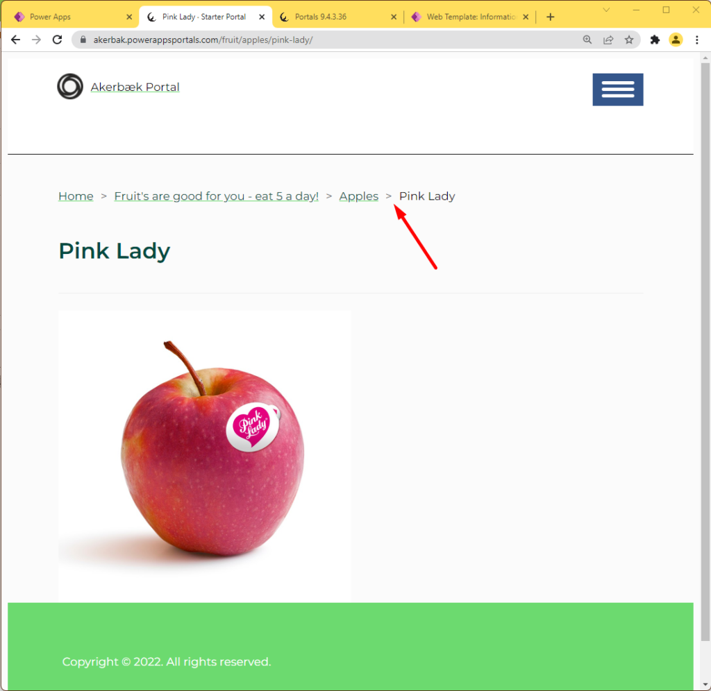
If we look at the code that creates the breadcrumb – where is the arrow?
Open web template “Breadcrumbs” in your Portal Management App to inspect the code:
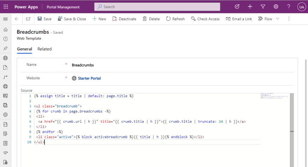
There are no arrows, icons, images or HTML that indicates where these arrows come from.
If we take a look at the breadcrumb through the browser developer tool we can see that it’s actually CSS ::before pseudo-element that brings the arrow.
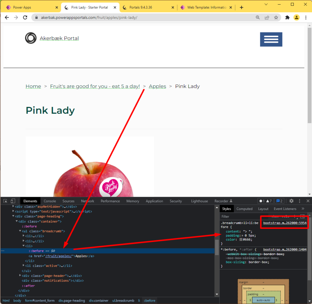
As we can see from the reference in the developer tool, this comes from Bootstrap. We would never make changes to the Bootstrap-file, but this is what the styling looks like:
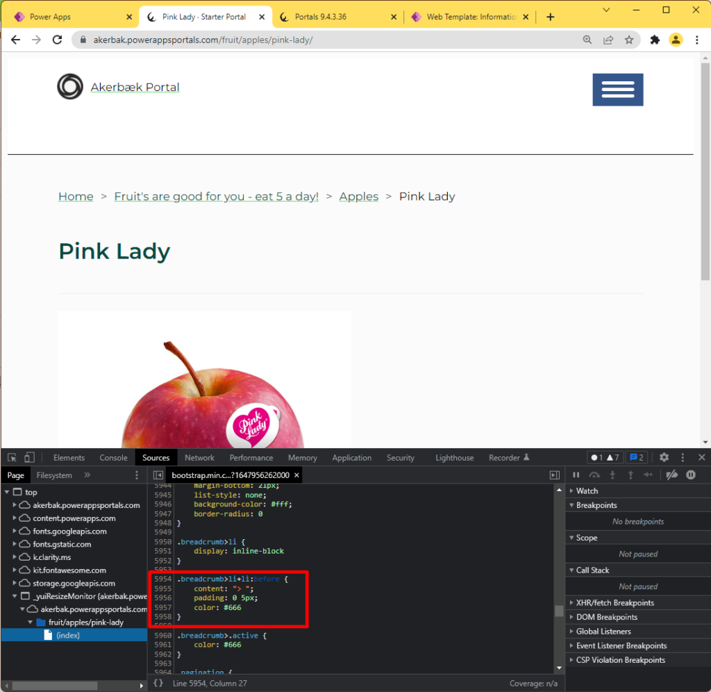
Let’s use the same mechanism as Bootstrap – but with an icon from FontAwesome.
Replace default arrow with FontAwesome Icon
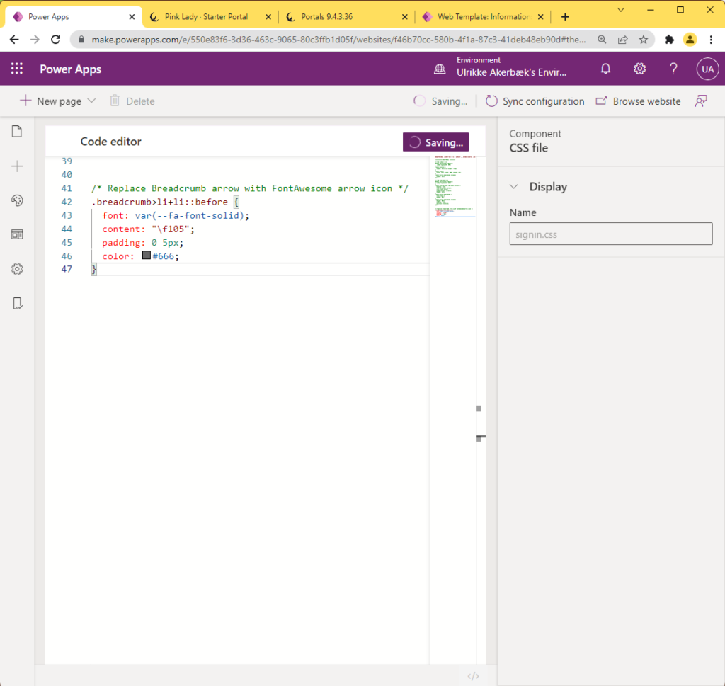
If you are using FontAwesome in your portal already you can simply add this styling to your CSS stylesheet and the default HTML-arrow is replaced by the FontAwesome-icon “Arrow-right”
/* Replace Breadcrumb arrow with FontAwesome arrow icon */
.breadcrumb>li+li::before {
	font: var(--fa-font-solid);
	content: "\f105";
	padding: 0 5px;
	color: #666;
}Code language: CSS (css)
I use Portals Design Studio to upload a CSS file and paste this code in directly:
The breadcrumb will now look like this
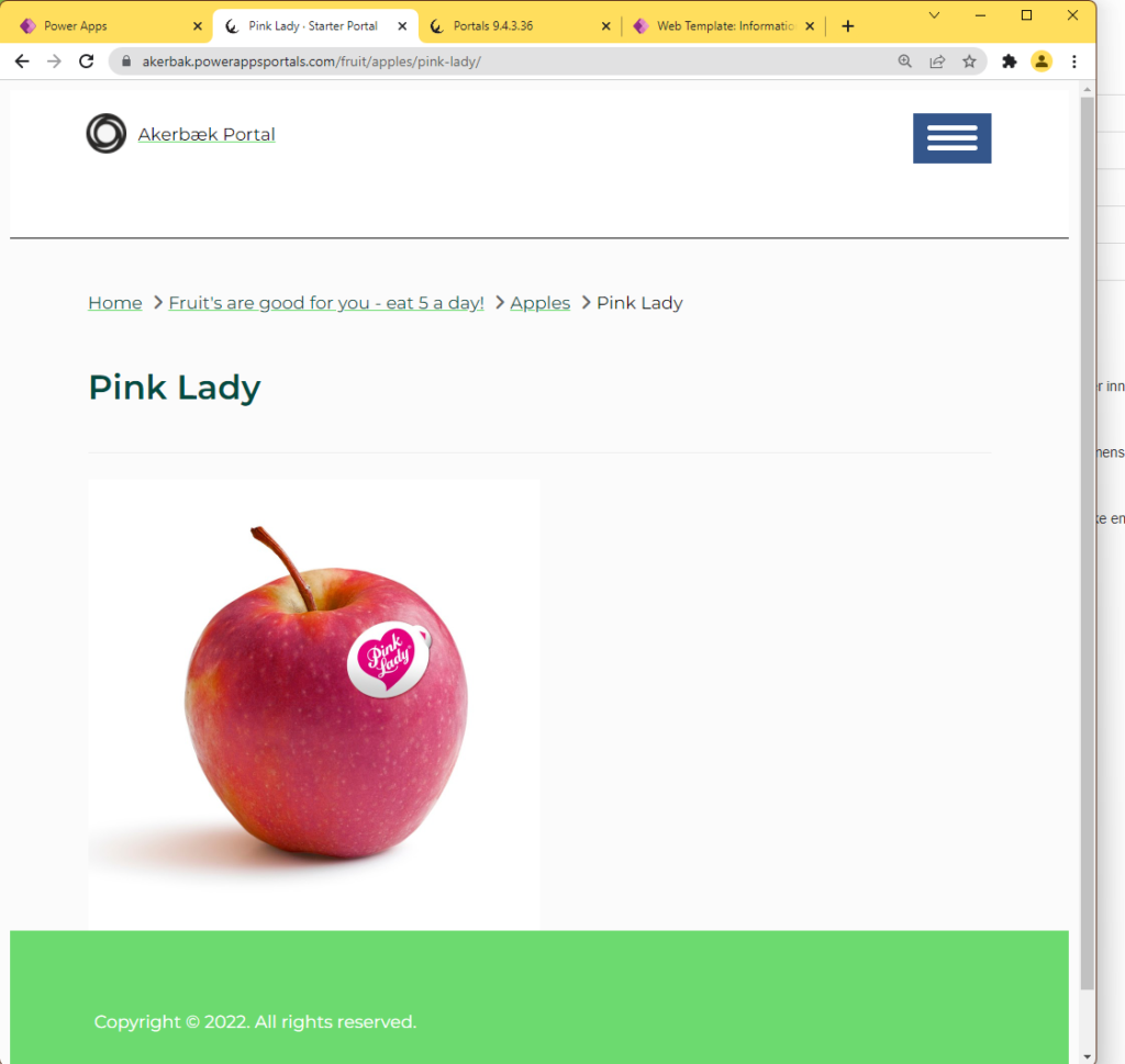
Before:

After:

Branding Canvas Apps
Branding can take many forms and it's not always easy to know where to start. Follow my blog post to learn more about the different approaches to branding Canvas Apps:
https://ulrikke.akerbak.com/2022/02/06/branding-canvas-power-apps/
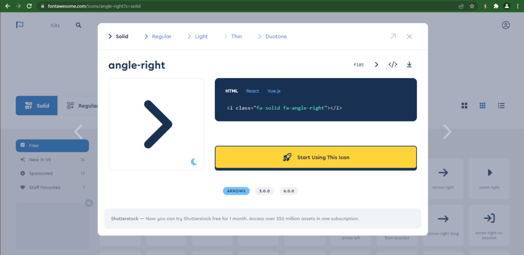
The icon
This is the link to the icon I chose:
https://fontawesome.com/icons/angle-right?s=solid
This is where you find documentation on how this works from FontAwesome:
https://fontawesome.com/docs/web/setup/upgrade/pseudo-elements
[…] Power Portal Breadcrumb with FontAwesome arrow […]
Hi there
It is interesting blog
In power apps portal you could add breadscrumbs like that
https://learn.microsoft.com/en-us/power-apps/maker/portals/add-breadcrumb
How have you added breadscrumbs on power page portal ?
Of I there is web template “Breadscrumb” but I don’t see how have you enabled to make it work on your page.